The Art of Serendipity

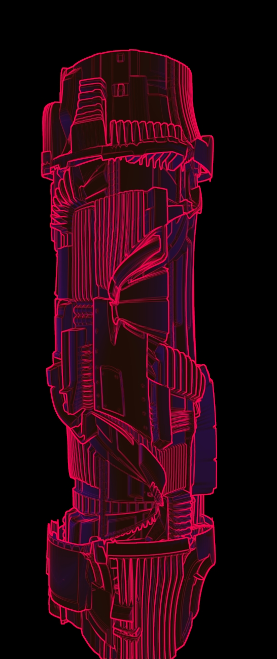
As a CGI artist, new and strange techniques are the sort of things always worth examining. One never knows what could result out of some obscure idea, such as UV sculpting (see the lightsabre to the right).

lightsabre endge rendered high detail

The interesting result of the confluence of two distinct techniques: edge-rendering and UV sculpting.

I happened across this fascinating article regarding “dual meshes”, I simply had to have a go. And it set my mind rolling. Just what else can this sort of thing do?

Having worked with some interesting looking meshes before, I decided to give this technique a quick whirl and then things took their own route, really.

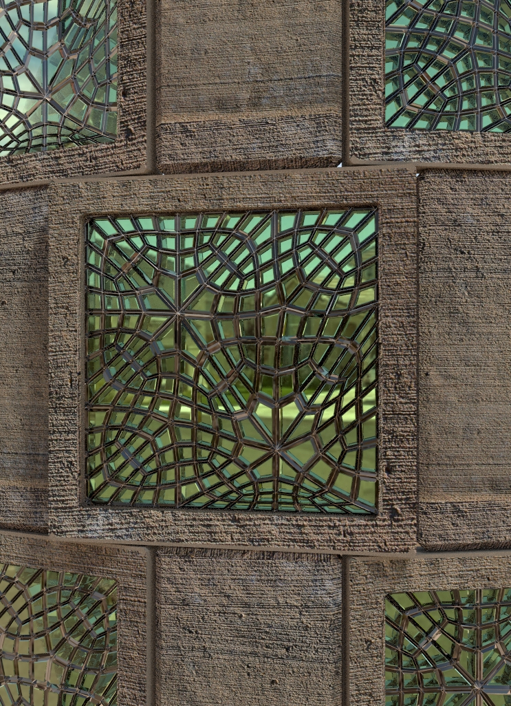
Some vertex moving minutes later, the thought struck me that extruding the faces of my interesting looking mesh would make for a fascinating result. And it did.

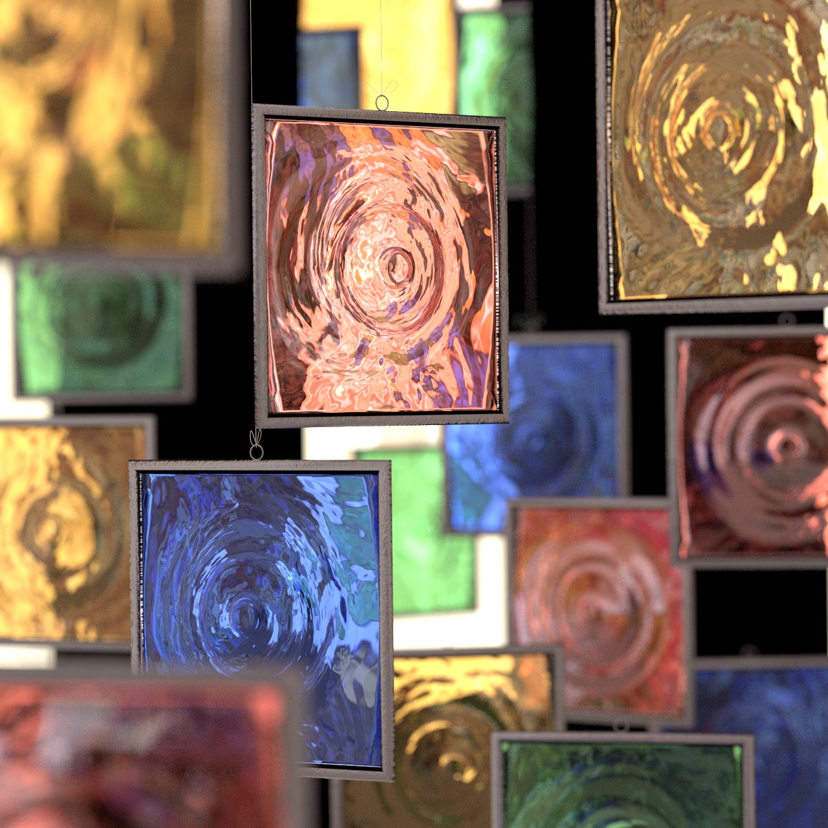
The result is some funky-looking glass bricks, that one could incorporate into a nice house, garden wall or secret evil hideout in the depths of the Transylvanian forests. Or similar.

What I particularly like about this technique is that it generate non-repeating complexity with very little work, which is very nice providing, of course, you have the hardware to render it.

A glass brick, modelled using a technique developed by Alessandro Zomparelli.

A glass brick, modelled using a technique developed by Alessandro Zomparelli.

Product magic

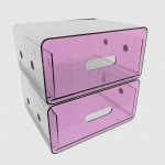
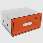
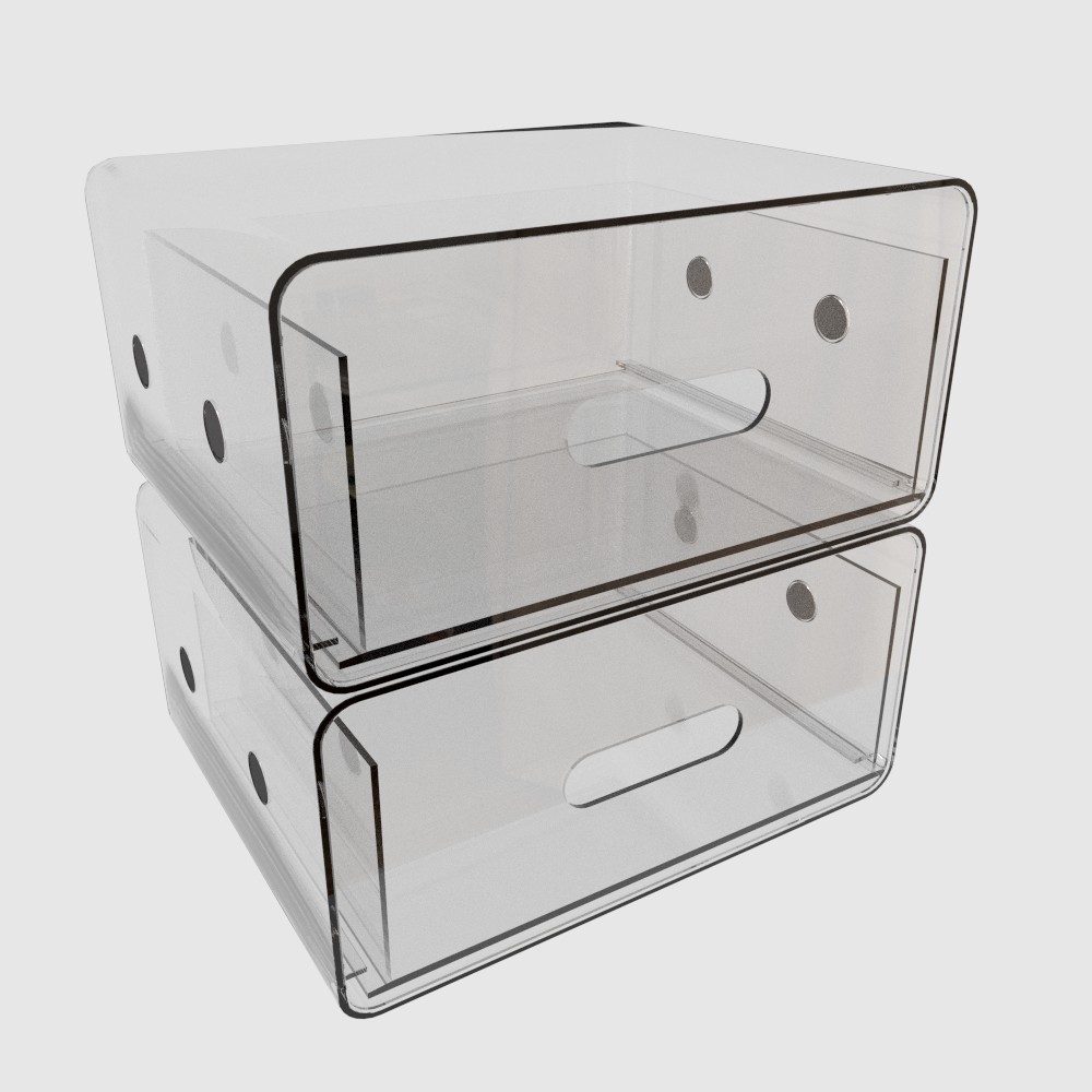
When Liz from designedbybear.com wanted to preview the new models of their range their were working on, she new this was going to be a tricky one.

Created for designbybare.com

Created for designbybare.com

Created for designbybare.com

Created for designbybare.com

All of their products are made of perspex, which is a nightmare to photograph, and even harder to render. Numerous designers had a go, and not one of them managed to deliver anything near what she wanted to see.


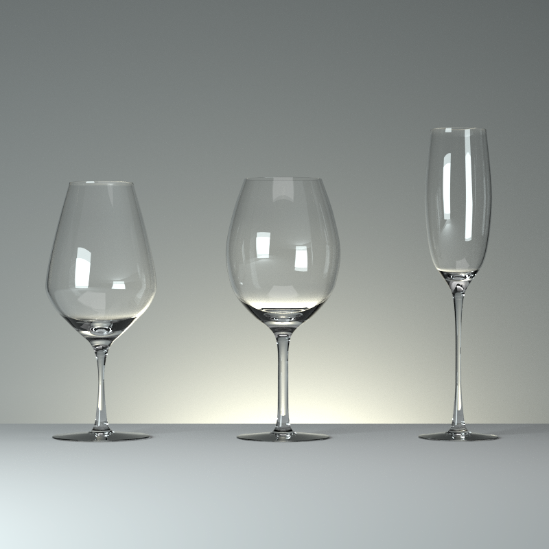
wineglasses

Once Liz saw my glasses, however, she knew that her worries stopped right there. Clearly, when it comes to materials and lighting, I really know my stuff.

The only problem was that she was in a hurry. Big time. Three hours later, though, I had finished waving my wand, and there was another happy client.

Created for designbybare.com

Created for designbybare.com


When your mind roams free…

…then everything is possible. So what do I think of when meditating in the bath? Usually, my art. That can range from the ekranoplan that is one of my current WIPs, my jetpunk stuff or – incredibly enough – bathrooms.

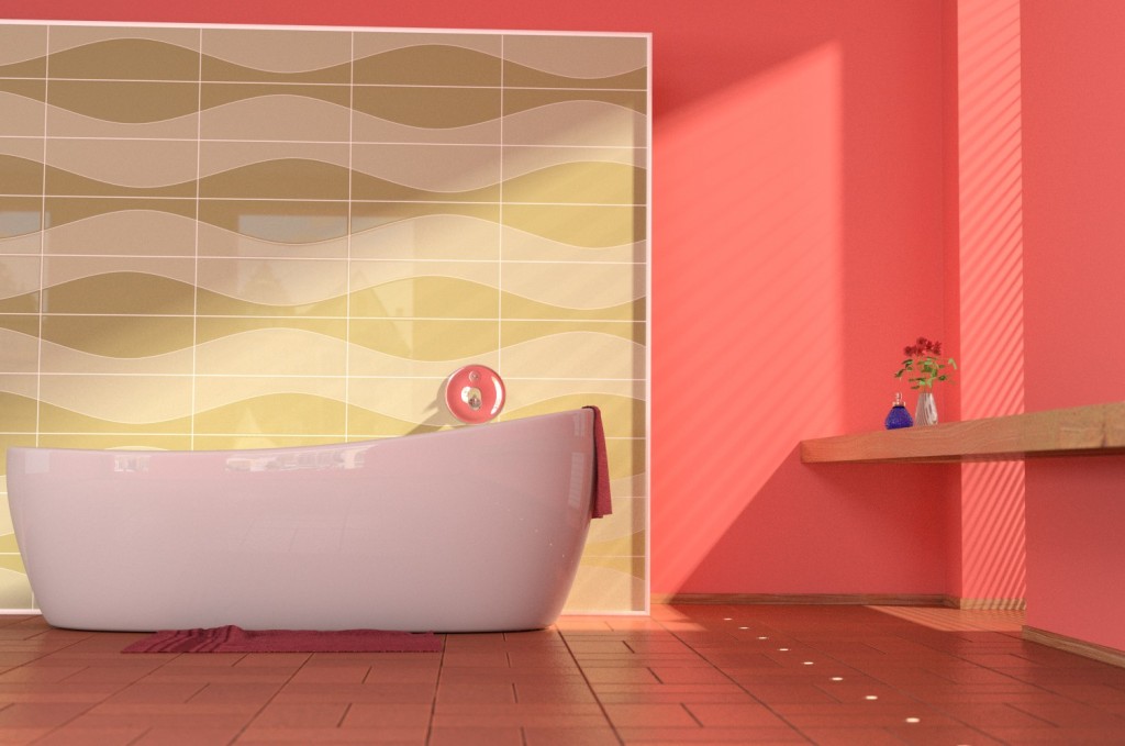
Hence the bathroom photo below. Well, I say photo; I really mean render, because that’s what it is. You don’t think it looks real? Please do tell me why.

bathroom


Interior perspextives

south west north west north

Scratches on rocks, daubs of paint, lines, chicken feet and one day glowing diodes, non-verbal communication that did not involve gestures was something that lies at the heart of civilisation. Whether it was the locations of fine hunting grounds recorded in ochre on a cave wall or hieroglyphics depicting the ten best tourist locations in ancient Egypt, technology has not freed us from this necessity. Far from it; digital cameras inside mobile phones we use as pocket computers have meant that being able to express ideas faster and more accurately becomes ever more urgent.

When Andrea Hall of UK TV Home Channel fame needed to explain her interior layout to her client, she was in a major hurry. Her drawings were simply not getting the message across, and the budget was tighter than the deadline.

This is when she turned to me for some kind of solution that would bring her ideas to life, and still leave her with some change for biscuits.

I happen to like the weird and wonderful, and this particular puzzle was definitely unusual. Fortunately, the fact that this was going to be a simple floor plan instead of a marketing brochure meant that photo-realism, or any other kind of realism, would not matter.

glass partitions south west BEV glass partitions north BEV glass partitions east BEV

It struck me that a CGI architectural model using coloured “perspex” sheets would suit this kind of project quite nicely.

Three perspective later, things were moving on swimmingly.

A charming email arrived with nothing more than a few scratchings here and there, and some hastily scrawled instructions. This is in fact exactly what I get from clients most of the time, since this is a speciality of mine: converting scratches to eye-candy.

Invariably there will be changes and this project was no different. When the client makes encouraging noises, I get the job done faster. Andrea pressed all the right buttons, and so when she charmed me into making last minute changes in roughly the same time it takes light to cross a wicket, I adjusted my sails and hoped my timbers wouldn’t shiver.

north 16 Jan 2003 west 16 Jan 2003 overhead 15 Jan 2003

I’m under the impression that the change was wisely spent on digestives.


A jetpunk lunchbreak

It is remarkable how serendipity sits so squarely in the middle of my artistic meanderings. A shape might catch my eye, a shadow perhaps look sufficiently intriguing to warrant a second glance, a cloud passing overhead like some majestic and fantastical creature sculpted out of candy floss.

In this case, it was a vase, I believe, that triggered a subconscious yet cognitive process that eventually bubbled to the surface in the form of an abstract profile.

Motoro jet casing

“What on earth could this possibly be”, I wondered as I stared at the screen. “Some king of kitchen appliance for an obscure food preparation process? An electronic toe-nail trimmer?” It’s utility eluded me for a while. I flipped it over, and then it was obvious. It was a jet engine. Not one we would be familiar with, intimately or otherwise. One from a parallel universe; a sister universe to steampunk. And so Jetpunk was finally born.

I modelled a little more. Clearly a jet engine as sporty as this needs some kind of afterburner. With an air compressor or turbo. With sensors. And fiddly bits. That look complicated.

clay render 008

We 3D artists tend to work with “clay” renders a lot. Instead of using realistic or otherwise materials to visualise the progress of the mesh and the shadows, a simple matte white is applied which allows all the minutiae to reveal itself in a glorious interplay of shadow and light.
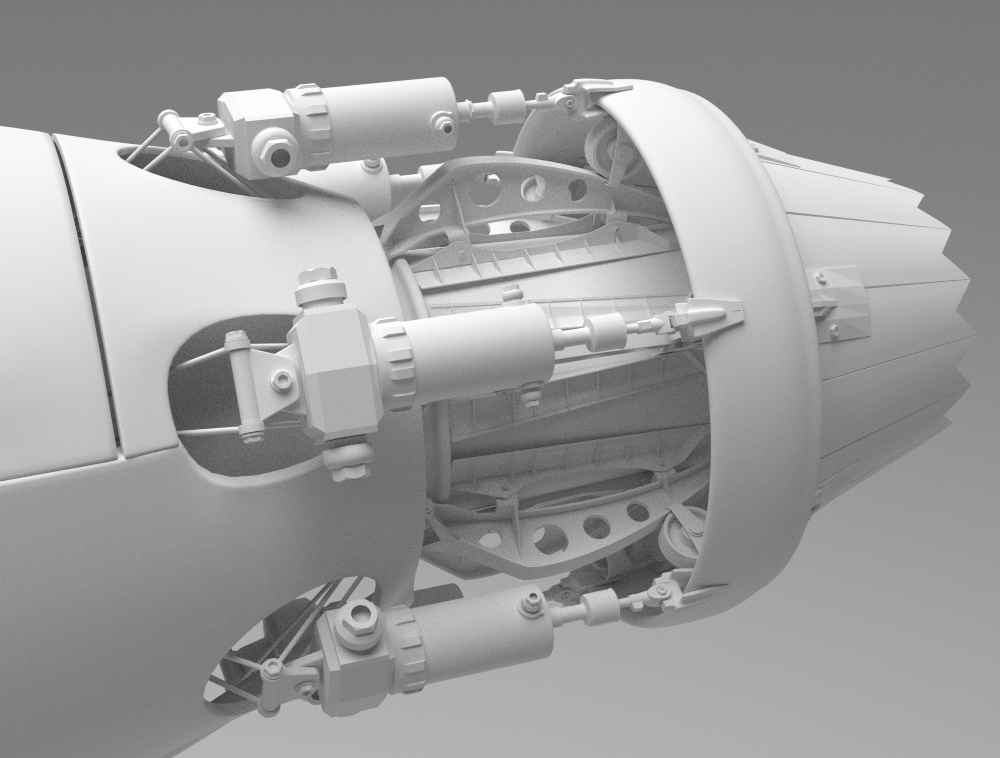
clay render 004

The detail bug bit me in no time. The project initially was conceived as a scene in which a mechanic has just left for his lunch break. When the thirst for even more detail became unquenchable, my mind seethed with the possibilities this funny little project presented itself with.

It has grown of its own volition; I am beginning to wonder who owns who now. I decided the engine was done in a moment of short-lived clarity; who knows. I might yet return to it before it is finally truly “done”.

I think we all need some motivation to get a job done well. I needed eye-candy to move on with this project. So when I started modelling one of the vehicles, I decided early on to drop the usual method of relying on clay renders, and decided to use rich chrome and cheap red car paint.
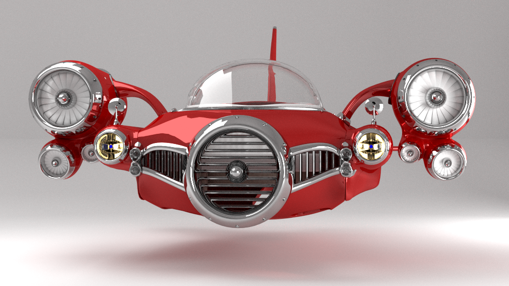
jetcar 009

Exactly what will come of all this, who knows? I have so many things I want to try out in this genre. The only real issue is: how much time can I spare? This stuff takes absolutely ages to do. Getting the details in, adjusting everything to fit; I have enormous respect for engineers who have to do this “for real”, and down to a budget as well.

jetcar 006

To shoehorn a particularly hackneyed phrase into the end of all this tedium: watch this space. Who know what will yet happen?

If you can’t wait, then follow this thread on Blenderartists.


Lightsabre UV sculpt

UV sculpted light sabre

UV sculpted light sabre

In this age of instant gratification, sculpting a David is really not something one would expect to do at the weekend in one’s garden shed. Despite this, classical sculpting is still a technique that has relevance in the digital age. There are several outstanding programs that are specifically designed for sculpting in 3D, and breathtaking cost aside, these have spawned a veritable army of sculptors whose creations span every imaginable genre, and then some.

Unlike the ancients, hours are not spent chipping away at lumps of virtual marble only to find a flaw in the middle of it, and I doubt that Michaelangelo or Donatello were able to press Ctrl-Z when they realised that they had forgotten to put some clothes on David. Sculptors now have tools no-one dreamed of even thirty years ago, and every material the human mind can conceive is at their finger-tips.

Despite all this almost sci-fi progress, there are still two key ingredients that have yet to be affected substantially: time and skill. The finest sculptures still require absolutely ages to sculpt, polish, texture, light and render (create a CGI “photograph”). The skill demanded is still quite daunting for the neophyte, and breathtaking for the art-lover.

This is why, when the occasional technique comes along to relieve the artist of the tedium that detailing an otherwise fun project is not simply welcomed, but greeted with open arms and almost infinite enthusiasm.

UV sculpting is one such technique. It essentially involves the use of very specialised images to displace geometry using image data as co-ordinate information. The geometry of this splendid lightsabre which is the subject of this post took all of 15 minutes to create. The material took approximately twenty minutes to fiddle with to get just so. The lighting and camera set-up took even longer. For greebling, this is truly a gift.

The lightsabre was created in Blender, a free and open source 3D program that is my tool of choice for all things 3D. It was rendered in Cycles, the splendid new engine from the Blender Foundation.

The Blenderartists thread that spawned all of this splendid effusion may be discovered here.

Click on the images below for in order to facilitate drooling over some splendid detail.

The gentleman’s choice for a Venusian hunt

If lashings of brass, copper and wood are your thing, chances are you would appreciate the steampunk genre.

There are two art periods that, despite thir utter contrast, fascinate me the most: Art Deco and Art Nouveau. Steampunk is simply Art Nouveau with sci-fi tacked on the end.

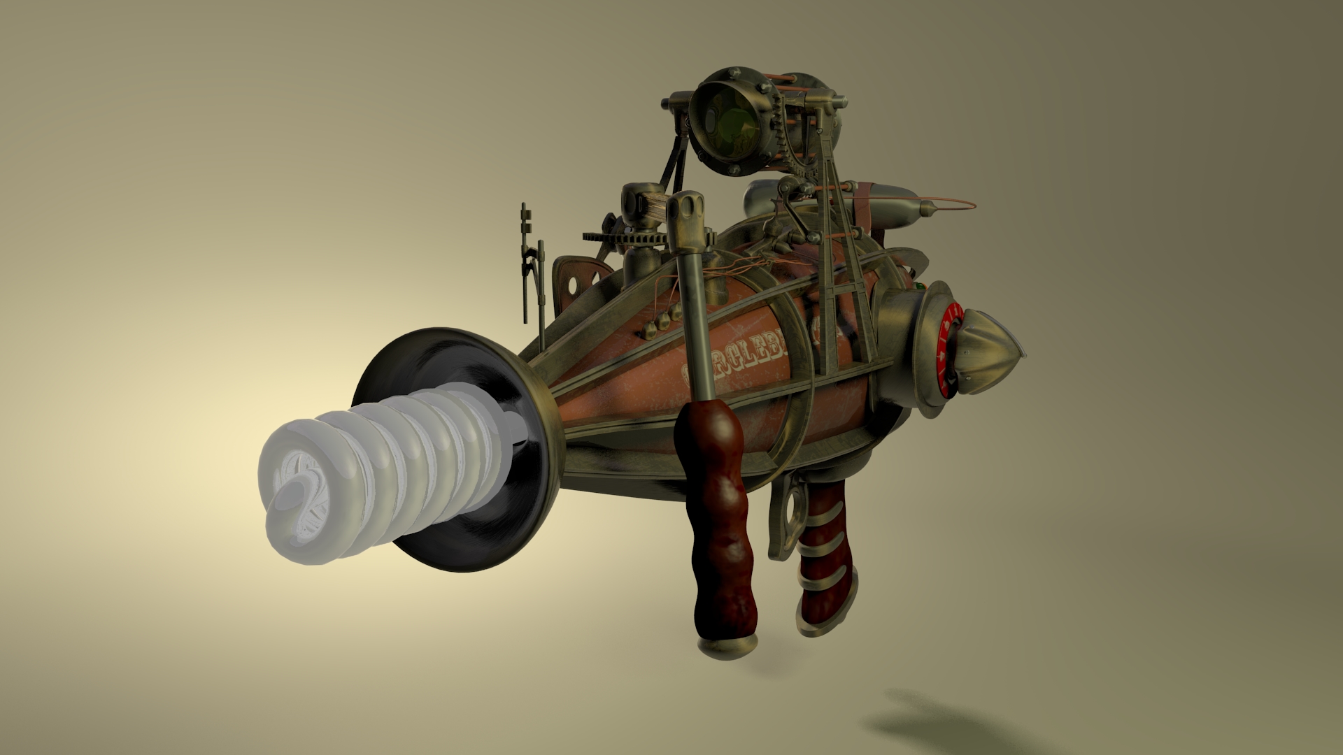
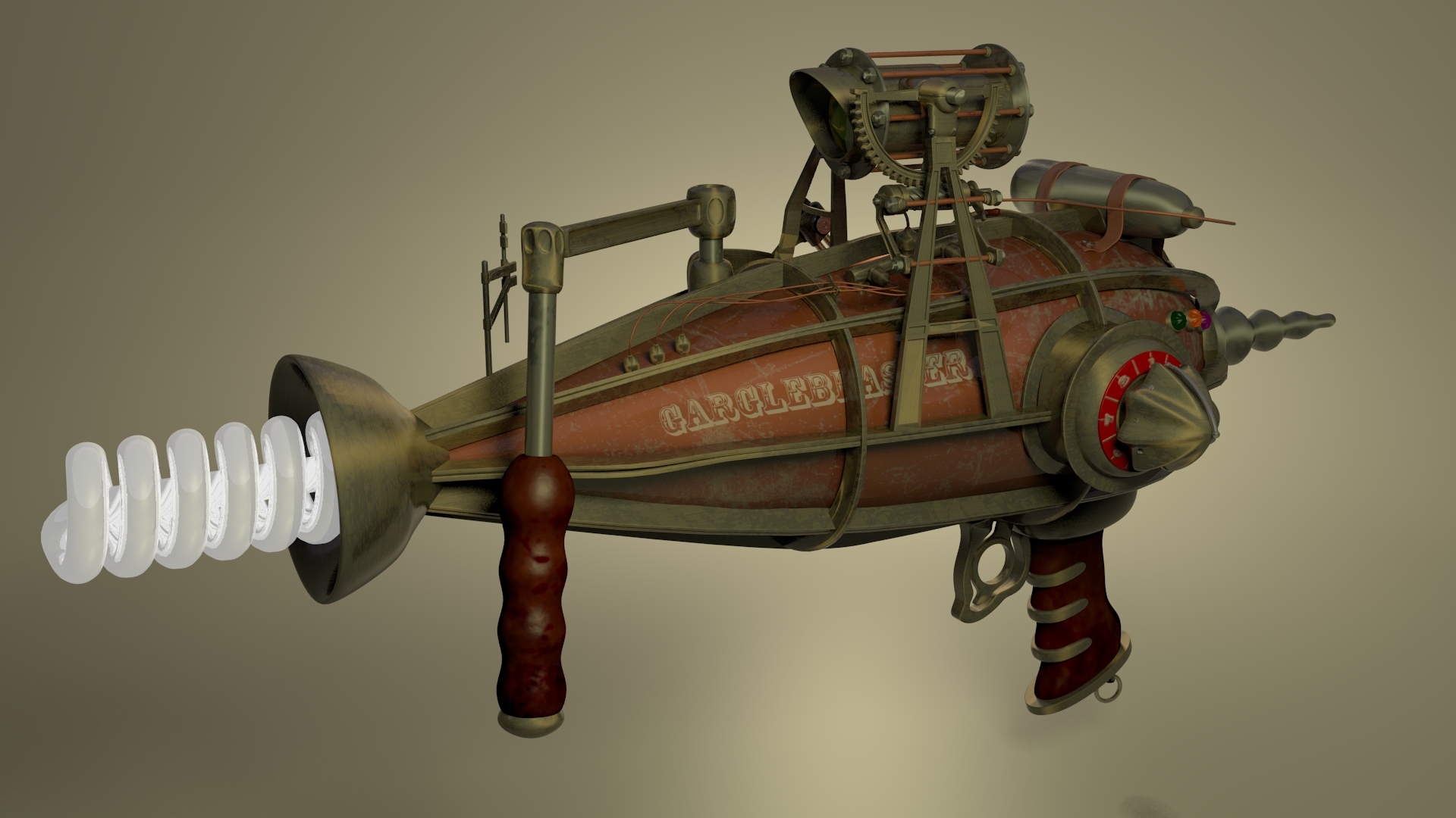
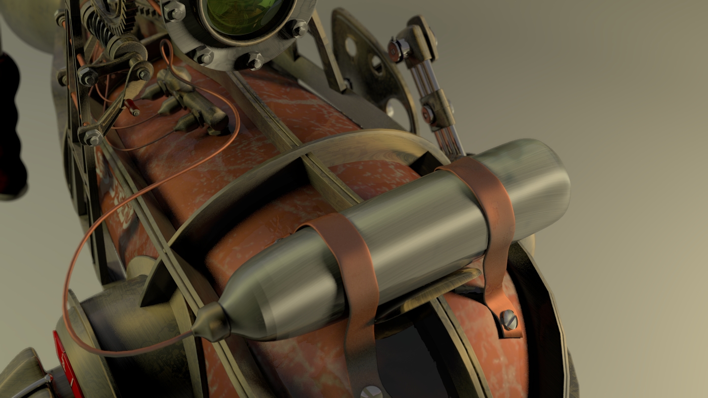
The Gargleblaster is a typical exemplar, with antiqueing to lend it some authenticity. Originally created for a WETA competition (didn’t quite make it due to the time zones yada) I really wanted to achieve a complex pipes-and-wires-everywhere thing.

It really is a work half completed, so given some spare time I will attempt to give this model its due.

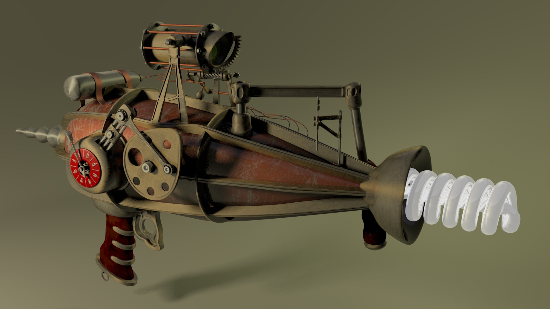
The full glory of this fabulous weapon. Brass, copper and wood with cogs and complicated bits.

Observe the hair-pin trigger, the complicated-looking knob the most certainly makes this piece of kit do something impressive, the beautifully printed “Gargleblaster” logo and so much more.

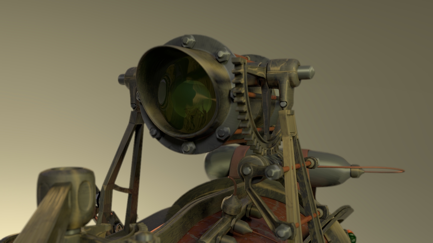
The gunsight was especially developed for the Gargleblaster and has unique features. I think.

“Pull the cavitation lever, adjust the Trebinthium injection manifold pressure, and enjoy some Earl Grey until the green lamp has been illuminated,” advises the manual.

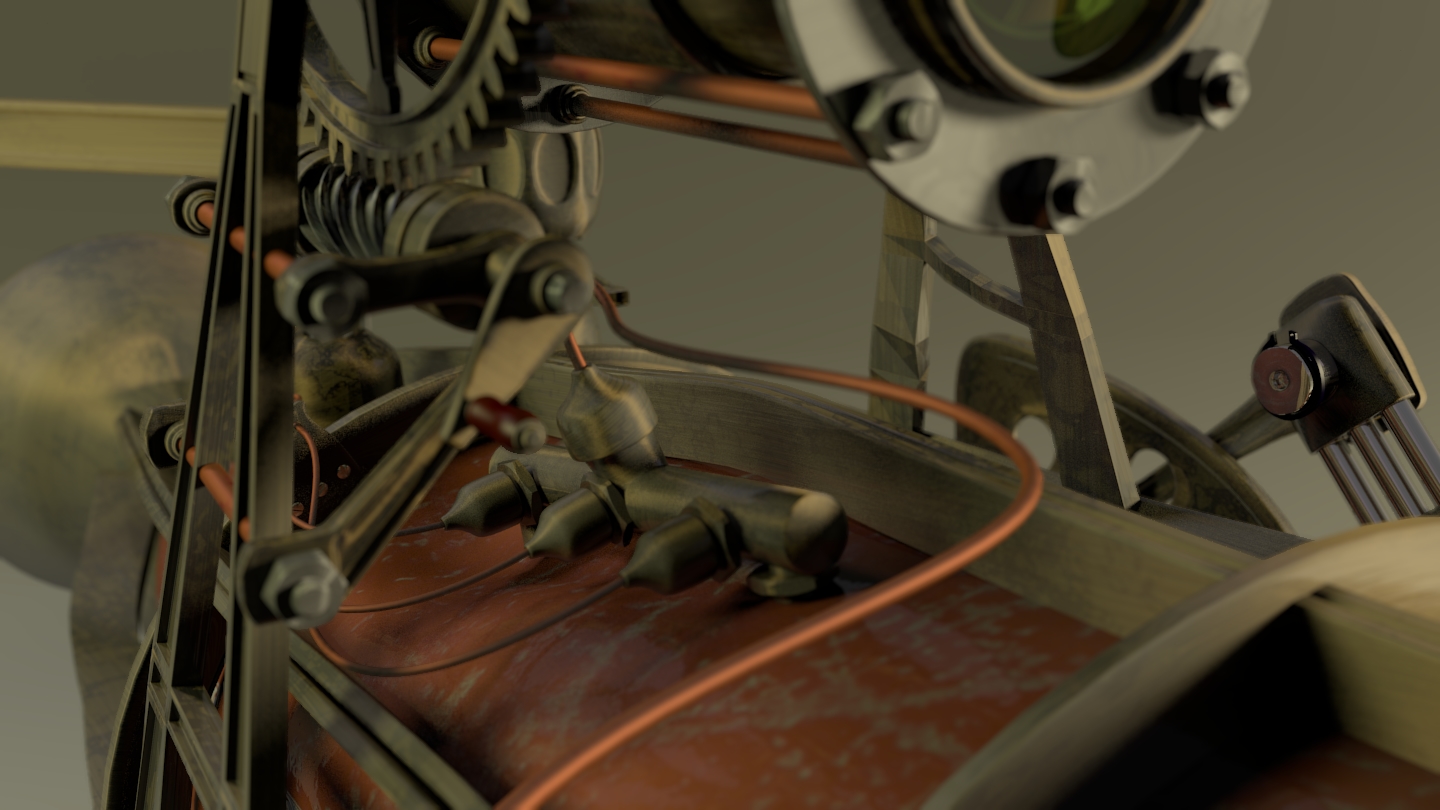
For those of a more curious nature, observe the Trebinthium injection manifold that is perched above the main quantization chamber.

Finally, the Trebinthium pressure chamber itself. Oh, what fabulous glory!

Split screen in KDE

I cried, wept, screamed, railed against a cruel fate and then decided to wander the interwebs for an easy way to pull this off.

You see, I had to create a split-screen animation, and there was no apparent simple solution. Using of the crop and pan and zoom effects caused more problems than they solved.

In the end, I used rotoscope, which I should have thought of originally. Except I had no idea that it existed, and even if I did, how was I supposed to know what it did?